How Forrest put a twist on fitness tracking — then did it all over again
Designer Matt Emmins talks us through how the two-person team behind Forrest got to v2 — and how Sketch helped them along the way.
There are difficult second albums, but when it comes to designing great apps, how do you make your first big iteration a hit? For the two-person team behind Forrest, the path from v1 to v2 was obvious and all a matter of time.
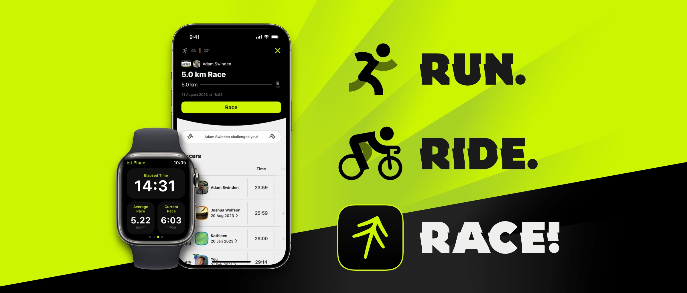
Forrest takes fitness tracking and adds a competitive twist. When you set up your workout, you can choose to race against your own personal bests or previous results, or even a ghost racer with a custom time, distance or pace. During your workout, you can see how you’re comparing to your virtual competitors on the app’s race screen and via audio prompts.
Matt Emmins and Adam Swinden — the duo behind Forrest — wanted to take things a step further with a social element that sees you competing virtually and asynchronously against your friends. Throw in a complete redesign, new iconography and a new freemium pricing model, and the pair had their work cut out. So, how did they do it?
We caught up with designer and co-founder, Matt, to talk through Forrest’s unique take on fitness tracking, how they got to v2 and how Sketch helped along the way.
The idea behind Forrest is pretty unique. How did it come about?
Forrest was born from a passing comment by Adam’s wife, Kathleen, who mentioned she wanted to know how she was performing on her runs, compared to the last one.
What she described was an experience akin to Mario Kart, when you race on a previously completed track against a “ghost racer” with your best time. Adam realized that this could work with visualizations and a set of audio prompts, and this now forms the bedrock of the Forrest race experience.
How did the first designs for Forrest come together?
The very first thing I designed was the logo. I remember when Adam came to me with the idea, I started scribbling these wild marks on a stack of Post-It Notes with a Sharpie. It started with mixture of lettering and abstract marks based on the name that Adam liked for the app idea, Forrest (as in Forrest Gump).
I remember when Adam came to me with the idea, I started scribbling these wild marks on a stack of Post-It Notes with a Sharpie.
I liked the lettering, but never loved it, but the mark was pretty solid (if I do say so myself). It was an abstracted, mirrored F, a bit like a tree. Where it all fell into place was the forward-projecting arrow. Speed, direction, forward motion. It felt like it was all in there.
The initial designs of the interface were poor, if I’m being honest, but that only led to us iterating quickly and throwing out what didn’t work. Adam has always been a huge advocate for mobile and best-in-class behaviors, so taking his lead on certain mechanics and architectural decisions led us to our first MVP.
What are the challenges you face when it comes to designing the UI for an app like Forrest?
The state of activity that someone is in is key to how the interface looks. For example, we designed the racer screen to show that ideal level of detail when we expect someone to be at their peak level of activity. There’s a progress bar along the top, showing the racer’s current position and progress, with little else to clutter the interface.
We use large tap targets for any key controls (pause, audio on/off and screen lock) and swipe gestures to move between the three key race views, each showing distinct data. We make these as large as possible to obtain maximum glanceability. When you pair these with audio prompts that automatically lower your music volume, it’s really powerful.

Deciding on the minimum level of information someone needs to understand what you are showing them, without removing context, is easier said than done. This is one area where I find that our iconography can help. Temperature and weather, for example, provide some context around the conditions to the day, but on the top level race feed it’s supplementary to the race data itself.
Deciding on the minimum level of information someone needs to understand what you are showing them, without removing context, is easier said than done
I’d say that this idea of simplification is one of the improvements of v2, over v1. We’ve always had more data and content heavy screens outside the context of a race, but once you’re in the race, we pare things back quite significantly. It’s only what you need, and nothing more. For most runners, I’d hazard they never look at it, but for riders with a handlebar mount, the head-to-head and stats views become a great HUD.
How did you come to the decision that it was time for a v2 of Forrest? Was it something you’d long planned for, or did the need emerge organically over time?
V2 is what V1 was originally supposed to be. We had always planned to build the mechanisms to race your friends, and the social aspect was mentioned in our very first discussion. It was only after we started work on the first version of the app that we realized we needed to break it down into smaller chunks to get something out.
The original build took about five years because of the arrivals of our two boys (who the app icon characters are named after). After hearing that Adam’s wife was pregnant, the aim was to launch before Theo was born. Then we aimed to launch before my son Isaac was born in June but ended up launching on 18th October 2020. During those five years, we changed things as we tested, used the product ourselves, and identified a whole roadmap of features — some of which are in v2.
Forrest is completely independent, self-funded and 100% owned by ourselves
Forrest is completely independent, self-funded and 100% owned by ourselves. With our growing families, V2 become even more important. We saw a chance to build a legitimate and profitable business for ourselves, affording us more time to spend with our families.
Beyond the new features that come with v2, were there any specific design goals you wanted to achieve?
From a design perspective, I saw v2 as an opportunity to simplify as much as possible. V1 wasn’t dense or cluttered but there were some aspects I could have improved, like signposting of final race positions in the feed, and better groupings of content to focus on distances and times.
The ‘create a race’ screen was a focus for us in v2. We wanted to make it as easy as possible to build a race. We made that race builder element a lot more consistent, rather than having three separate controls to change the settings. This seems to be working really well and makes it easier for users to succinctly see what exercise they are about to start.

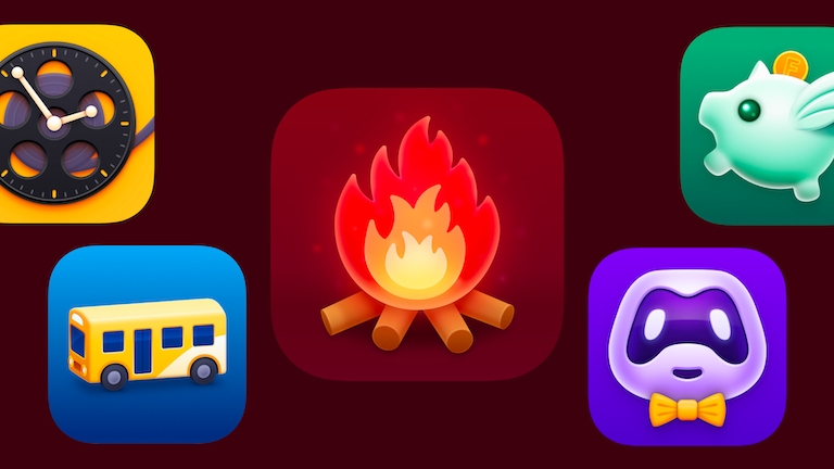
Another element that I particularly enjoyed working on was the curation of a new set of app icons, both internally-crafted, stylistic interpretations of the logo, and also a set of designer icons which were generously donated by the community. We want to keep this going, but giving artists and designers free reign to interpret the thing you’ve built is super exciting.
We also introduced light mode, which has been an enjoyable challenge, given the accessibility issues of our brand green (#CBF500) on a light background. Finally, it was an opportunity to redesign our entire icon suite. I’m a sucker for an icon and we probably would have launched three months earlier if I spent less time drawing them.
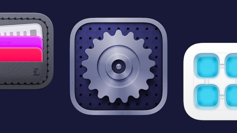
Tell us a bit more about that iconography. How did you go about creating a set of icons that were unique to Forrest, while giving them all a consistent look and feel?
I’ve always been a huge lover of icons, and the fact that you can distill an entire thing into this simple pictographic representation. Its like a design quest for pure simplicity and clarity while retaining the truest form of their meaning.
As a whole, Forrest is a blend of curved and hard edges, which allows a great degree of flexibility while still retaining a level of consistency. The race type icons, which use a lot of rounded forms in the shape of stop watches and clocks, are now solidified with more structured and slightly more squared off edges than their v1 counterparts.
Icons are like a design quest for pure simplicity and clarity while retaining the truest form of their meaning
For something as small as the weather icons in the feed, I was working with 1 px strokes on 20x20 Artboards. I added some pops of colour to these and rendered them as full colour assets, as opposed to the tinted PDF assets I would usually supply, to help convey the extra nuance of time and temperature.
One of the things I actually struggled with, which took a great deal of tweaking, was building out a set of icons, that felt consistently weighted in dark mode. Strokes and text often feel heavier when reversed out into a negative palette, so this meant creating a whole suite of icons that felt optically consistent with their light mode counterparts, despite being 1-2px thinner.
Were there any additional challenges you faced, or considerations you had to make, when it came to introducing the social element of Forrest v2?
The social aspect is full of nuance, from how do you onboard people, to creating an account, to finding people, managing who can see your information, and handling various states for following, requested, accepted etc. Does someone have a profile image? What do you show if they don’t? How do you handle errors during sign up or when something fails to sync?
The app is still free to use and works locally without an account. Not forcing people to sign up was still important so they could use Forrest without barriers, and hopefully want to experience more of what the platform offers.
One challenge was designing a flexible interface that does a good job of showing data that we have no control over. We want Forrest to transcend geographic boundaries, and names outside of western culture are typically many characters longer than “John Smith”. It’s little things like that, that until you are using real data and stress testing it, you realise that you can’t account for in a picture perfect design.
What does your history with Sketch look like? And why was it your choice when it came to designing Forrest?
We’ve been using Sketch ‘at work’ since about 2018 when we moved all of our interface design for client projects across from Adobe Illustrator. Sketch gave us the pixel precision we needed, with a robust toolset, while maintaining the vector and scalable elements we loved in Illustrator.
Work on v1 of Forrest began in April 2015, so almost all of the first version was designed in Illustrator and exported as flat graphics for Adam to interpret. It was only after we transitioned to Sketch at work, that I started porting small amounts of our design over manually, tidying them up, and creating Symbols and workable screens.

V2 was almost organically born from my fourth ‘tidy up file’ where I was trying to nail my colors, Symbols and keep the document as pristine as possible. It was just me working on it, but I knew that it would make my life easier in the long run. It started as a blank canvas, porting in previous Symbols, tidying them up and refining them as I went.
The plethora of features Sketch offers, and the quality of life improvements that have come in recent updates, continue to make working with it a delight
Outside of Forrest and client projects in general, I’ve spent a great deal of time wondering if the grass is greener on the other side with Figma. Although I find what they are doing really compelling, the native Mac app, performance and the current feature set of Sketch is too compelling to move away from. Sketch allows me to design with little limitation, and it probably contributes to less stress than more, which is always a benefit.
Despite my familiarity with Sketch, the plethora of features it now offers and the quality of life improvements that have come in recent updates continue to make working with it a delight.
Are there any specific Sketch features that have helped you in the process of designing Forrest?
I’d say some of the key features of Sketch that have been the most helpful are also the ones I now take for granted. In areas like the feed, we have many repeatable elements, and with Symbols, we have one single source of truth to edit these from. It means making changes takes a fraction of the time, as the updates cascade through immediately.
Smart Layout properties for Symbols make them even more powerful. The feed Symbol, for example, is the same ‘shell’ whether you race yourself, or another racer and some Personal bests. Building a complex nested Symbol with automatically resizing components makes the design process easier, but also insanely satisfying when you want the content to grow based on the data you change around.
Building a nested Symbols with automatically resizing components makes the design process easier and insanely satisfying
Being able to create a single icon as a Symbol and Tint it Color Variables saves duplicating Symbols and creating multiple icons. The best example is the ghost racers, where I want to show visual variety in the designs with yellow rings or purple rings, rather than all the same.

We have a wide colour palette in Forrest. We use colour to identify the opposition racers in the feed, we have the key brand colours and then colours for our medals. And then of course there’s light and dark mode. With Color Variables I only have one catalogue to edit and keep consistent.
I’ve also found the Sketch — View and Mirror app to be super helpful. Being able to instantly see my live design on a device helps to make decisions quicker and more effectively. Working purely from a laptop doesn’t give you the same real-world context to your designs.
What does your workflow look like with your co-founder, Adam? How do you prepare your designs for handoff and make sure they’re in the best possible state to build from?
Typically we’ll discuss an idea over Slack or on the phone. From there, I’ll create an initial pencil sketch and then take it into Sketch to start working it up. As I do this, I’ll fire over screenshots via Slack and get Adam’s thoughts and feedback. I’ll continue to iterate in Sketch until we’ve nailed what we’re working on. I’ve tried to make sure that all colours, styles etc. are fully documented, but I could definitely keep a cleaner document. Sorry Adam.
I then export my designs to Zeplin for Adam to start his build. Adam builds, and then we test. I’ll provide any QA or feedback, and then with any luck it’s on to the next feature. Our workflow is pretty simple, and it probably works due to our small team size and good working relationship.
From a personal perspective, I have a huge amount of admiration for Adam. He has been beyond instrumental to Forrest’s success so far. He is a huge advocate for best-in-class experiences, and pushes me as a creative to go further. Thank you Adam, without you there is no Forrest!
Forrest is available for download on iOS.
Have you made something great with Sketch? We’d love to see it. Tell us about it in the community forum!