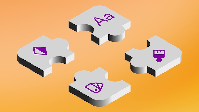
A beginner’s guide to icon design in Sketch
Learn how to create your own icons without needing to be an amazing illustrator
Author
Creating pixel-perfect icons, especially ones that work at small sizes, might seem like something you’d need an advanced diploma in vector editing to achieve. But if you know the right techniques, you can combine a few simple shapes with some of Sketch’s most basic features to produce some pretty impressive results.
Today, we’ll run through three simple techniques to create icons in Sketch. Zero drawing skills required! Better still, you can take these techniques and apply them to all sorts of scenarios, not just icons.
You’ll learn to create icons using:
- Boolean operations such as subtract and intersect
- Borders
- Basic shape tools like Oval and Rectangle
- Vector editing
Let’s take a look 🔍
Creating a location pin icon using Subtract
Press O to activate the Oval tool and create a 12x12 px circle. You can hold ⌥⇧ to create a perfect circle outward from the center. Alternatively, you can quickly insert the circle and adjust the size through the Inspector.
By default, each new shape will have a gray fill and a border. Let’s get rid of the border and set the fill to black. Now, select the layer again and press 5 to reduce the opacity to 50%.
To create the hole in our location pin icon, duplicate the circle layer by selecting it and pressing ⌘D. Then hold ⇧⌥ and scale it down to 6x6 px.
With the reduced opacity from before, it’ll now be easy to see how shapes overlap before we commit to cutting anything out.
Now the fun part, reshaping the bigger circle to make the pin shape. Double-click on the circle to enter Vector Editing Mode — and drag the bottom point straight downward to stretch it out.
This point currently has two handle control points that are bending the path. We want a straight hard corner instead, so double-click to switch to a Straight point. Then, soften the point by applying a corner radius of 1.
To finish things off, select both layers and use the Subtract Boolean operation on the toolbar to cut the front layer out of the back layer — and you’re done!
Creating an eyeball icon using Difference
You can create an eyeball icon using the same technique as before, but let’s try a different way this time. Head to the second Artboard and draw a 28x28 px circle using the Oval tool.
You’ll notice that the circle is bigger than the Artboard itself — which is totally fine. Move it up so that it’s 5px from the bottom edge of the Artboard.
Duplicate the layer, this time holding ⌥ and dragging out a duplicate — or you can use the same technique from the previous step. Position your duplicate 5px from the top edge of the Artboard.
You can already see the overlap forming the shape of an eyeball, so select both layers and apply the Intersect Boolean operation — which keeps only the overlapping area.
You can keep the shape as is, but we’ll give you a few more pointers to soften up the corners. If you double-click to edit, you can see that the circles are still there because Boolean operations are non-destructive. To turn the visible result of a Boolean operation into a path, we’ll first need to flatten it by clicking on the Tools button in the Toolbar and selecting Flatten from the dropdown menu.
Now, go back into Vector Editing Mode and nudge the side points in by 1px. Select them both and change the point type to Straight on the Inspector. Yes, the angles will look pointier now, but we can give them a rounded corner radius of 1. Press ↵ to exit Vector Editing Mode.
For the pupil, create a 10x10 circle, duplicate it, and scale it down to 6x6 px. Make sure the layers are centered, select them all, and click on the Difference Boolean operation to alternate adding and subtracting the overlapping layers all in one swoop. And that’s a wrap 🌯
Creating a magnifying glass icon using Borders
For this last one, we’ll be drawing with borders instead of fills. As with the examples before, you can create this icon using any of the techniques we’ve covered, but let’s explore this last technique.
Head to your last Artboard and create a 14x14 circle. Tap F to remove the Fill and B to add a Border. Change the color of the border to black, increase the width to 2px, and make sure the position is set to Inside — though it’s likely the default.
Now, for the magnifying glass handle, let’s draw a line segment using the Vector Tool, which you can trigger by pressing V. You can also use the Line tool, but we recommend the Vector Tool for more precision. Before drawing your line, head to the Inspector and click on the Snap to half pixels button, the third one below the sizing controls.
Next, click to make the first point a half pixel up from the bottom of the circle and then move down a bit and add a second point. Hit ↵ to confirm you’re done drawing and give the handle the same style as the circle.
To round out the squared-off bottom of the handle, you can expand the border — we’d go for 3 px — and switch to a rounded cap end. At this point, you can group the layers, rotate them and call it a day. But we’ll walk you through a few more steps to make it look just like the other icons we worked on today.
Select both paths, click the Edit icon on the toolbar, and choose Outlines. Now, rather than having two paths with borders, we have two compound paths with Fills, which you can join using the Union Boolean operation.
Hold down ⌘⇧ and drag the bounding box until you rotate the shape to -45 degrees. You can also flatten the whole thing down into a single, optimized compound path. And that’s it!
Just like that, we drew three icons using three different techniques — and learned plenty of tricks along the way. We hope you picked up a few new skills and feel more confident creating icons in Sketch. If you’ve got any questions or want to learn how to create something specific, you can always ask our incredible community over in our forum.