Meet the Maker: Duncan Horne
“If you see a really cool icon design with a crazy effect, try and recreate it yourself.”
In our Meet the Maker series we talk to designers who push the limits of our beloved app, and find out what drives and inspires them. Today we’re chatting to Duncan Horne: a freelance icon designer, as well as a front-end developer and “some other things in between”.
How did you get started using Sketch?
I first came across the app in around 2014 when I started my first design role with a software company. I had just managed to nab an invite to Dribbble, and a lot of the work I was inspired by appeared to be made using Sketch, so I decided to try the app out myself.
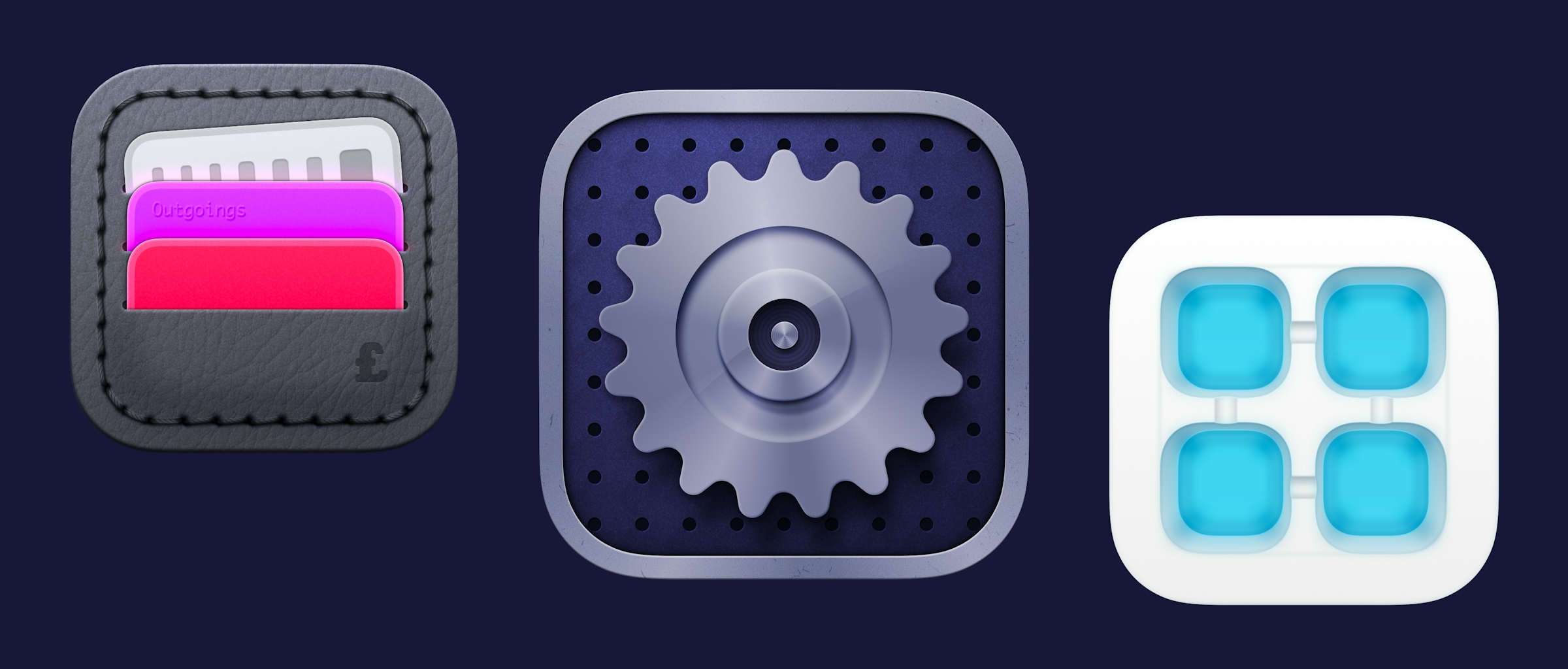
What inspired you to create the work you’re sharing with us?
I’ll always remember the time I moved from using a Windows PC to my first G4 iMac in 2003. I fell in love with the dock straight away. The way icons were treated and the detail they portrayed was such a breath of fresh air. This is probably the root of my love for app icons. Nowadays designers such as Gavin Nelson, Matthew Skiles and Michael Flarup are a massive source of inspiration — hopefully one day I’ll be able to see myself on a level playing field with them.

Duncan’s Wolverine illustration — made in Sketch.
I’m a massive comic book fan, and these are the other large source of inspiration to me when it comes to the illustrations I produce, whether it be the artwork and drawings inside or the textual title treatments on the cover. I can always find something in every issue that gives me a spark to create something of my own.
In general, though, I just love things that look nice, whether it be something made by a designers and artists, or a particular form or scene in nature.
What tools and features in Sketch do you use the most?
I use strokes and gradients a lot, and time and time again I find myself sifting through the different Blend Modes to see what works best. I frequently use Blur Tools too — I think sometimes even a very slight blur can give a design a lovely soft effect that makes it look just that bit more professional. Oh, and let’s not forget the trusty Vector Tool!
What advice would you give to anyone looking to create something similar to your designs?
I think the best advice I can give is to copy creations that you love. If you see a really cool icon design with a crazy effect, try and recreate it yourself. Even if you think you might have to use different tools to the original, give it a go. You’ll undoubtedly learn something new and gain another arrow in your quiver along the way.